Monday, September 6, 2010

Does size really matter?

It does when it comes to windows!

Greetings from my backyard! It is Labor Day and man have I labored! Our culture highly values home ownership as one of the key goals of the American Dream. No one ever prepares you for the crappiness that comes along with this dream such as the To Do list that only gets longer and never gets shorter...now try handling that list as a single person. Very exhausting! So when a long weekend rolls around is this girl thinking BBQs and picnics? Nope, she's thinking time to cross some things off that list. What can I say, I have no life outside of this house and work.

Among painting the kitchen, master bath, and my office, my to do list includes things like digging up the front yard so I can have grass instead of weeds, killing the crab grass in the back yard and re-seeding before the moss takes over, un-packing my office from my furniture shopping spree at Ikea, and the usual laundry, bathroom cleaning (I have 3!), vacuuming, mopping, dishes...oh yeah, can't forget cooking/making meals! A girl's work is never done. So, with that said, I had a few goals this weekend. I failed at every single one except for one sanity saving grace!

The BIG thing I wanted to do, besides relax and try to grill on my own, was to hang some blinds in the master bathroom. For those that know me, I am not much a fan of the typical mass produced blind. They lack character and texture and tend to bring the decor of a room down (Aluminum mini blinds, ick! Vinyl verticals, double ick!) . Not good right? Up until now, I have refused to put any up.
So what changed my mind you might be thinking. The bathrooms! If any room requires privacy, it's the bathroom. My powerder room on the first floor permitted absolutely none at night and little during the day. My master bath got horrible lighting during the day, and not enough privacy at night. I shouldn't be afraid to walk around my own home naked! Not that I do, but it's the principal of the thing gosh darn it! Just for the record, Shawn and I went swinging in the tot lot behind my house one night and I could see STRAIGHT THROUGH my first floor. Really, straight through the back door and out the front door to my driveway. Needless to say, my neighbors across the common area can see straight through my house as well!

The search for blinds ensued. No mini's here! No natural types like bamboo and stuff either, which is what I already had in the master (I had a nice grass cloth venitian style blind. I loved it, high points for character, charm, and texture and the spa quality I hope to envoke...but these types of materials are meant to filter light only. Don't expect any privacy as you can see right through them at night.) No custom made ones, either! I think my powder room, which is a relatively tiny (yet tall) window would have cost me about $400 for custom fitted faux wood blinds. I think $30 at Home Depot is a lot more affordable, don't you?
As I mentioned, the blinds I chose came from Hope Depot. Two inch faux wood slatted blinds that were embossed to look like a wood grain on the slats as well as the valance. I liked that they were a decent illusion of the real thing rather than looking absolutely fake, which is typical. Why faux you ask? Mass produced, real wood blinds are available at afordabale prices, but they tend to be flimsly, light weight blinds that will break in a heartbeat. Oh, and remember I was looking for something for my bathroom(s). Bathrooms are very humid from all those hot showers and bubble baths (ooooh, bubble bath...). Real wood would warp in these conditions. Faux wood maintains its shape.

So I had the type I wanted, now to find the right size! My windows are the most atypical things around and not even consistent within my own home. Most exasperating, let me tell you! Thank goodness Home Depot (and Lowes) have a couple of brands that can be cut to size so you are not paying an arm and a leg for custom blinds for those akward sizes like mine. (For example, my powder room was 32 and 7/8 inces wide..really, builder, couldn't you have just made it 33"????)

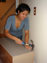
So for those that were watching my Facebookpostings, you all know I made a little (ahem) boo boo. I measured the width of my windows...but I had no idea blinds also came in different lengths as well! Home Depot seemed to have two lengths available for the blinds I wanted: 64" and 72". Um...uh oh...which ones? Eep! Well 64" for the master bath, that window was definitely a squat one, but the powder room? I have 9' ceilings on that floor, but the window wasn't floor to ceiling. The blind cutter had a ruler on it and it didn't look like the powder room could be longer the 64"...have I mentioned that I am horrible at eyeballing ANY type of dimension?


Oh was I wrong and will never forget to measure window length again! You'd think I would have learned my lesson from the highwater curtain fiascos from when I first moved in to this place. Nope! Not only were the blinds for the powder room a bear (think a different B word for a more realistic description) to put up due to the narrowness of the space (both room wise for the lader, and space wise for the drill and screwdrivers to install the brackets)...the blinds are also 11" too short for the window. Yes my friends, 11"...even the long ones would have been highwaters at 3" too short. As you can imagine, I wanted to pull my hair out (As a side note, I was also trying to grill a lovely organic sirloin steak for dinner as I was installing my blinds, but the damn grill just would not get hot enough to cook anything and I ended up with a crappy dinner!).


My sanity's saving grace was the blinds for the masterbath. Perfect fit and easy install (Also revealed my numerous mistakes from my first attempt at hanging anything AND using power tools from when I installed the woven shade two years ago. I definitely will need to fill those holes in when I sell this place in a few years). They also work in the room. Clean color, clean lines...brings in all the day light and blocks peeping tom's at night. I am very happy with the blinds for my bathroom...unlike the powder room which depresses me everytime I pass it...which is everytime I come downstairs!


Now, it has been suggested I should sell that set on Craig's List since cut blinds are NOT returnable. Another option is for me is to move them to another window where they that might fit. The first floor window is an inch too long (just one freaking inch! ARGH!), but I can move them to the kitchen for the sink window OR hang them in my bedroom where I have three windows with the relative same width and which clock in at 61" tall...I think...


Monday, August 9, 2010

Color My World

Almost all of us have a favorite color, or at least a particular color we seem to be drawn to (favorite is such a strong word, right?). My favorite color is orange. Many of you already know this about me. So why have I not painted (or even decorated) a single room in my house orange? I have to be honest, I tried. Emilie is my witness that I had some orange hued paint chips taped up on the first floor walls! Persimmon, coral, butterscotch, spiced cider...Unfortunately, my beloved orange just won't work...except for my awesome orange leather chair. I WILL find it a home. LOL! So how to chose a paint color when you can't chose your favorite? I am in no ways an expert in interior design (Dear Genevieve, I would love for you to design something for my first floor!), but I do have some steps that have helped me through my endeavors.

My first step is to consider the room itself. What room or space is it? What do I use it for? How often do I use it? How is the lighting? Etc., etc. The two rooms I was considering to tackle where either the kitchen or the foyer. Well, the kitchen will have to wait until Shawn has time to help me out since moving kitchen appliances on your own is not safe...which includes damage to myself and to the house! That means I chose the foyer, which you probably already guessed from the first pic. This is the first space my visitors will see of my home, and the last. It is the last place I see on my way to work every day and the space that welcomes me home. Since I am in an interior unit, it tends to be dim and the narrow hallway to the rest of the first floor does not help in the lighting department much, either. Poor lighting in a small space where your sense of sight is basically a requirement rules out deep or dark colors, which make a space not only darker, but makes it feel smaller, too. Sooooo, this rules out the latest trendy colors of gray, black, deep navy and the like...but not orange...at this step I can still consider my fave funky favorite!


The color happy dance is short lived as my next step comes into play. Now it is time to consider how you want the room to feel. Color and emotions are deeply linked. Psychology, anthropolgy, biology...let's not get into the details on the research. If you're reading my blog, they you've already seen it, heard it, or read it somewhere else from HGTV, DIY Network, Real Simple, Better Home and Garden...you're guilty and you're proud of it! Where was I? Oh yes, how do you want the room to feel. As I mentioned earlier, this is the first and last space visitors see of my home. First (and last) impressions are key here. I want people to feel welcomed and comfortable when they come over. When they leave, I want them to take good memories with them. I do not want them to enter a dark, cavernous entryway. It needs to be light and open. And yes, I want it to be stylish. Orange is bright. Orange is fun. Orange is a happy color and very energizing like most citrus colors are (Did you know it also stimulates the appetite? Colors in the red family are known for this. Never paint the space where you eat red or orange unless you want to gain 20 pounds!). Orange is also very shocking and surprising. No matter how good it may look in the end, the first impression upon entering a home with bright orange walls is a disoriented "WHOA!" to put it nicely. Bye bye, orange. I still love you. So what colors to chose to evoke the message I want? Blues are nice. Very calm, serene...sorry, but I am not changing out my hardwood foyer floor so my guests have something softer to sit on as they medidate or to land on after they fall asleep on their feet. Slight exageration, I apologize. So we want welcome energy, not shocking energy. The colors that fit the billet most often are yellows and greens. Both come in bright shocking shades, but also a wide variety that are very friendly to work with. Green is often seen as a harmonious color. It's blue side bring calmness, but it's yellow side brings warmth. Yellow is a perky, cheerful color that is laid back at the same time.

So I had ruled out any deep dark shades of any color, reds (which includes orange and pinks), and blues. On the color wheel that leaves green, yellow, and white. Heck, my walls are already white, why bother to paint them at all except to clean up any blemishes? Well that is my next step. You need to be true to yourself. I love color. I express myself with color everyday from the pens I write with, to the bright pop of color in the accessories I choose. I am still disappointed that the patent leather, stop light yellow pumps at Nine West that came out about two and half years ago did not come in my size. At least I was able to get them in hot pink! With that said, I allow white the dignity of being considered a color, but it is often not me. So green and yellow it is!

My last step is to test colors out in the space. I often go to Lowes and Best Buy since Benjamin Moore and Sherwin Williams keep odd hours and are often closed when I leave the office (If you can afford them, their paints are awesome). I stand in front of the rows upon rows of color chips and snatch two or three each of the colors I am drawn to. I have an entire photo box filled with these, BTW, and I throw out all the duplicates! The reason I get more than one is because rooms have more than one wall. If you are planning on using a single color, it is easier to consider a particualr one without the distraction of having to move a chip from wall to wall. Now this is important. It may look great in the store or in your car on the drive home, but once you get it home a color that made you smile an hour ago can make you cringe after your slap that painters tape on the back and put it on your wall. Although I was considering greens for my foyer walls, I was really cheering for yellow. I had about twenty different shades of yellow and as each one turned into a school bus, No.2 pencil, or washed out when nighfall came and the ceiling lights came on I began to dispair. Finally one yellow did seem to work. I liked it, but I didn't love it. Green, could I love you? At least one of you? I kept the chip of Olympic's "Dusty Yellow" up and taped some greens next to it. Hmmm, not bad. Not bad at all, but not quite there. I added more to my palette and narrowed the colors down to the Dusty Yellow, and two greens: Lemongrass and Appletini. I kept the chips up and I was really digging the appletini, but my eyes would still glance over at the dusty yellow. Well, by the time I get to buying a paint sample, I typically have narrowed my choices to one color. This time it was two. Painting a larger piece of poster board with each color was going to make or break one of them.


So which was the winner? Dusty Yellow or Appletini? Drum roll please!

Tadaa! Appletini!

Don't feel sorry for the Dusty Yellow, though folks!
It won first place for the kitchen! It will also be going in my stairwell, which will bring continuity between the two floors. Is it just me or am I a chosing a lot of greens and blues for my house?
I'll be posting more pictures up in an album on Facebook soon. This blog does not cooperate very well when it comes to photo placement. My next blog will about the awesome and very easy art work I made for the foyer.


Sunday, July 11, 2010

Eureka!

I know I promised some new paint colors, I will get to those soon. Right now, I am still working on those pesky walls! The sun room is still throwing me for a loop! I decided to test out a third pattern, which I think I like. On the other hand, it still leaves the wall wanting...something. Therefore, I have moved on to the living room where I will also demonstrate another technique for hanging wall art.


I have these amazing canvas pieces that I bought when I moved out of my parents house into my first apartment back in 2006. For those that knew me then, they are the three square canvases that hung behind the couch. I like them, because of the multiple layers of vibes I get from them. They are serene, but still impart a warm energy. They are elegant, but casual at the same time. They have that zen quality of balance, but without the sterile minimalism. They definitely go with my typical style, which I like to call Organic Elegance. Who wants to take a stab at defining that? Lol! They were a pretty amazing bargain, too! I believe they were $40 each, which is pretty cheap for this size (19.5" x 19.5"). Just go to Michaels, an empty picture frame this size typcially runs at least $50. At Bed, Bath, and Beyond (where I have found these same pieces as prints rather than canvas) or Target they would run about $60-$80. I won't even go there for how much something like this costs at Pier1!

Ok, so these pieces have been sitting on the floor all over my town home. I debated putting them them above the headboard in my bedroom, in the foyer above the side table, on the wall by the sliding back door to the yard, on the other side of the foyer as you enter the first floor, even broke them up and scattered them around. I should have just went with my original instinct. I bought them for a living room, just keep them in the darn living room! Really, this is what you get when you have stacks upon stacks of decorating magazines and watch HGTV nearly 24/7! Too many ideas that crowd out your instincts.

Yay, step one complete! I know what I am hanging on my wall. Time for step two: how am I going to hang these on my wall? That is actually easy this time. Since I only have three and do not want to spend a lot of money to find filler pieces. I am going to hang them horizontally like I did in my apartment.
So, my last post consisted of discussing how cutting out the shapes of the frames or artwork can help you visualize the finished arrangement before taking hammer and nail to your [painted] walls. I did that again here, but I have an added another step. When you want to hang things horizontally, you probably want them to be at the same height, right? I thought so. Well, after my experience in the sun room moving my paper mock-ups just a bit up, a little bit down, crap I went to far to the left, I came up with a pretty neat idea to help get that out of the way quicker. Actually, it is half my idea, half Better Home and Gardens.

This is another one of those repeated advice articles, but it has always been aligned with the tricky task of hanging art or pictures in a stairway. Use string to make a grid to guide you. Brilliant! I bought a 200 ft roll of bright colored twine for only 97 cents at Lowes. Not bad! Worked amazingly. The trick is not only the string, but also the use of a level and a little assistance from more blue tape. Do not forget the level unless you want to keep stepping back to look, then back up the ladder to adjust (repeat until just right!).


Anyway, I think I have my design. The three canvases aligned horizontaly, with two 12" floating shelves that will allow me to swap out table top frames and other interesting little pieces tokeep things fresh. I like it when a task comes to a resolution.


Tuesday, July 6, 2010

All Walled Up

I am at a dilema. After over a year and a half in my townhome, it is time to get something on my walls and I am stumped. When it comes to positioning anything on a wall I get nervous and even more so when that wall is painted and I have no touch up paint left over! I am the kind of person who will move an object back and forth a million times until it is just right. You don't really have that option after drilling a hole big enough for a wall anchor.


With an idea in mind, I set out to find something that matched what I was imaginig for my brightly colored sun room. The goal was sturdy, but sleek, simple black picture frames (preferrably matted) that were reasonably priced. By reasonabaly priced, I mean cheap. I am a bargain hunter, what can I say? Originally, I was thinking 11x14s, but as I perused the aisles of Michael's I came across something a bit more unique and cost only $10 a pop: 10x10s matted for 5x5s. Even better, the Home Gallery section was 50% off. Score! At $5 each you betcha I scooped up the last six in the store. Isn't shopping fun when you actually find things you want to buy????


Now for the dilema. Would my imagination look as good in reality as it did in my head? Eep! I can't drill or hammer anything yet!


As many of you know, I tend to snatch my mom's Better Homes and Garden magazine when she and my sister have finished reading it and Val has cut out all the recipes. I also tend to waste my money by purchasing all their special publications rather than subscribing and saving a butt load of dough, but that is another story. Anway, one piece of advice that tends to be recycled over the years is to make paper cut-outs of the shapes of the frames or artwork you want to arrange on your wall. Not completely economical when your frames don't fit within the parameters of the standard 8.5x11 sheet of paper, but not too costly if a) you know where to shop and b) you don't want to ruin your walls.


Good thing I did the cut out thing, because my original idea of a row of three frames on either side of the mirror just isn't jiving for me. Hmph.


Now to figure out whether I can work out something nice with the frames I already have, or if I need to return them and find something else. Wish me luck!


Sunday, July 4, 2010

Independent Lady

Happy Independence Day! Is it bad that I use holidays to catch up on housework (and sometimes work work)? Today I finally finished cleaning my deck to get it ready for some protective sealer.


So the standard rule when you have a deck built with pressure treated wood is that you need to let it "weather" for a year. One of my handy co-workers mentioned something about the chemicals used in the wood. From a recent Google search, it sounds as if the chemicals in fresh pressure treated wood prevent a sealer from penetrating the wood. Feel free to correct me if my information is incorrect. The point is, the wood was absorbing water, which means time to seal!


Since a deck is exposed all day every day to the elements, it's a good idea to use a deck cleaner on the wood. It revives the look of the lumber and gets rid of nasty things like mildew stains. During my initial search, the majority of deck cleaners required diluting and scrubbing. You know me, I don't have that kind of time! Luckily, I found a cleaner made by Olympic that did not require either. Unfortunately, that didn't prevent this project from being back breaking!


Clean then rinse. Clean then rinse. I also did a little brushing (not quite scrubbing). Helped even out the "bleaching".

Okay, enough for today! Tomorrow I'll be trying out some paint samples for my kitchen and the foyer.

Saturday, July 3, 2010

An Encouraged Attempt


At the encouragement of several of my more tech savvy friends, I am venturing into the world of Blogging. Now what will I be blogging about, you might wonder. Well, for the most part it will be on my adventures as a new homeowner. My friends and co-workers tend to get a kick out of my decorating posts on facebook, and even more so when I get to the maintenance issues and power tools get involved. Maybe a random non-home related post here and there when the fancy strikes.We'll see how this goes, but first things first...learning the art of blogging!