Almost all of us have a favorite color, or at least a particular color we seem to be drawn to (favorite is such a strong word, right?). My favorite color is orange. Many of you already know this about me. So why have I not painted (or even decorated) a single room in my house orange? I have to be honest, I tried. Emilie is my witness that I had some orange hued paint chips taped up on the first floor walls! Persimmon, coral, butterscotch, spiced cider...Unfortunately, my beloved orange just won't work...except for my awesome orange leather chair. I WILL find it a home. LOL! So how to chose a paint color when you can't chose your favorite? I am in no ways an expert in interior design (Dear Genevieve, I would love for you to design something for my first floor!), but I do have some steps that have helped me through my endeavors.
My first step is to consider the room itself. What room or space is it? What do I use it for? How often do I use it? How is the lighting? Etc., etc. The two rooms I was considering to tackle where either the kitchen or the foyer. Well, the kitchen will have to wait until Shawn has time to help me out since moving kitchen appliances on your own is not safe
 ...which includes damage to myself and to the house! That means I chose the foyer, which you probably already guessed from the first pic. This is the first space my visitors will see of my home, and the last. It is the last place I see on my way to work every day and the space that welcomes me home. Since I am in an interior unit, it tends to be dim and the narrow hallway to the rest of the first floor does not help in the lighting department much, either. Poor lighting in a small space where your sense of sight is basically a requirement rules out deep or dark colors, which make a space not only darker, but makes it feel smaller, too. Sooooo, this rules out the latest trendy colors of gray, black, deep navy and the like...but not orange...at this step I can still consider my fave funky favorite!
The color happy dance is short lived as my next step comes into play. Now it is time to consider how you want the room to feel. Color and emotions are deeply linked. Psychology, anthropolgy, biology...let's not get into the details on the research. If you're reading my blog, they you've already seen it, heard it, or read it somewhere else from HGTV, DIY Network, Real Simple, Better Home and Garden...you're guilty and you're proud of it! Where was I? Oh yes, how do you want the room to feel. As I mentioned earlier, this is the first and last space visitors see of my home. First (and last) impressions are key here. I want people to feel welcomed and comfortable when they come over. When they leave, I want them to take good memories with them. I do not want them to enter a dark, cavernous entryway. It needs to be light and open. And yes, I want it to be stylish. Orange is bright. Orange is fun. Orange is a happy color and very energizing like most citrus colors are (Did you know it also stimulates the appetite? Colors in the red family are known for this. Never paint the space where you eat red or orange unless you want to gain 20 pounds!). Orange is also very shocking and surprising. No matter how good it may look in the end, the first impression upon entering a home with bright orange walls is a disoriented "WHOA!" to put it nicely. Bye bye, orange. I still love you. So what colors to chose to evoke the message I want? Blues are nice. Very calm, serene...sorry, but I am not changing out my hardwood foyer floor so my guests have something softer to sit on as they medidate or to land on after they fall asleep on their feet. Slight exageration, I apologize. So we want welcome energy, not shocking energy. The colors that fit the billet most often are yellows and greens. Both come in bright shocking shades, but also a wide variety that are very friendly to work with. Green is often seen as a harmonious color. It's blue side bring calmness, but it's yellow side brings warmth. Yellow is a perky, cheerful color that is laid back at the same time.
So I had ruled out any deep dark shades of any color, reds (which includes orange and pinks), and blues. On the color wheel that leaves green, yellow, and white. Heck, my walls are already white, why bother to paint them at all except to clean up any blemishes? Well that is my next step. You need to be true to yourself. I love color. I express myself with color everyday from the pens I write with, to the bright pop of color in the accessories I choose. I am still disappointed that the patent leather, stop light yellow pumps at Nine West that came out about two and half years ago did not come in my size. At least I was able to get them in hot pink! With that said, I allow white the dignity of being considered a color, but it is often not me. So green and yellow it is!
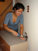
My last step is to test colors out in the space. I often go to Lowes and Best Buy since Benjamin Moore and Sherwin Williams keep odd hours and are often closed when I leave the office (If you can afford them, their paints are awesome). I stand in front of the rows upon rows of color chips and snatch two or three each of the colors I am drawn to. I have an entire photo box filled with these, BTW, and I throw out all the duplicates! The reason I get more than one is because rooms have more than one wall. If you are planning on using a single color, it is easier to consider a particualr one without the distraction of having to move a chip from wall to wall. Now this is important. It may look great in the store or in your car on the drive home, but once you get it home a color that made you smile an hour ago can make you cringe after your slap that painters tape on the back and put it on your wall. Although I was considering greens for my foyer walls, I was really cheering for yellow. I had about twenty different shades of yellow and as each one turned into a school bus, No.2 pencil, or washed out when nighfall came and the ceiling lights came on I began to dispair. Finally one yellow did seem to work. I liked it, but I didn't love it. Green, could I love you? At least one of you? I kept the chip of Olympic's "Dusty Yellow" up and taped some greens next to it. Hmmm, not bad. Not bad at all, but not quite there. I added more to my palette and narrowed the colors down to the Dusty Yellow, and two greens: Lemongrass and Appletini. I kept the chips up and I was really digging the appletini, but my eyes would still glance over at the dusty yellow. Well, by the time I get to buying a paint sample, I typically have narrowed my choices to one color. This time it was two. Painting a larger piece of poster board with each color was going to make or break one of them.

So which was the winner? Dusty Yellow or Appletini? Drum roll please!
Tadaa! Appletini!


 It won first place for the kitchen! It will also be going in my stairwell, which will bring continuity between the two floors. Is it just me or am I a chosing a lot of greens and blues for my house?